It used to be that BBC & ITV would save all their programmes up for the big Autumn schedule, but that seems to have gone away now and you tend to get things spread about a bit more through what were used to be the fallow periods. Plus with the major competition from Satellite, Cable and now the Internet they can't really afford to keep things under wraps for too long. However it's the latter that seems to be throwing up the more interesting TV from the USA via the wonder of Bittorrent.
How did we used to live waiting for shows to cross the Atlantic to be shown on our networks six months after they've aired in the States? How did we manage to wait a week until the next episode? Downloading shows via the filesharing networks has, along with Sky+, revolutionised watching television in our household.

"Heroes" is really the show to blame for this. Word of mouth drummed up interest in this show, and about halfway through the US broadcast of the first season, we took the plunge and downloaded the shows shown so far. It was one of those rare shows where you watched one episode, and then.. you had to watch the next. What was intended to be just a quick viewing of an episode before bed turned into a five hour marathon only halted by the need for sleep.
Of course the first season is now about halfway through on it's UK terrestrial BBC2 showing, but in the US the second season has already commenced, so we're downloading and watching the new season episodes weekly and it's a frustrating experience! I need to see the next episode... now! Grrrr.
Heroes Season Two so far is a bit of a slow burner. It's four months after the (not quite) explosive events in Kirby Plaza and almost all of the characters are flipped in intention and situation from where we first met them last year. There's some new characters, and the killing off of some familiar ones also. And a new enemy, and maybe the return of an old one. Far too early to pass judgement yet but it's so far not up to the high standard of the best of the last season, but not much is.
So what else is there to view?

Readers may remember my article earlier this year about remakes of old TV series and films, and in particular NBC's "Bionic Woman". I responded to criticism of the casting of ex-Eastender Michelle Ryan as Jamie Sommers saying "wait and see" before having a go. And I've been proved right - she's actually pretty good in the role and her American accent is top notch. The first episode of the show is not bad. They've revamped the pilot which was doing the rounds in the summer, dumping the deaf sister for a delinquent high school kid sister instead, and Battlestar Galactica's Katie Sackhoff makes a great Bionic nemesis. It's a neat update. Not sure it's got legs though, as the second episode was lacking somewhat with a bit of a dull story about germ warfare terrorists, and it looks as if it may turn into espionage adventure by numbers. We'll see.
I've also watched the first episode of "The Riches" with Eddie Izzard & Minnie Driver heading up a family of travellers who steal the identity and lifestyle of a wealthy couple who've just died in a road accident. They intend to steal the American Dream. It's black comedy at times, with some dark undercurrents. Izzard's accent is shit but he manages to rise above this in the lead role of Wayne Malloy, a conman who wants so much more for his family and shows subtle hints of stopping at nothing to get it. Driver plays his heroin addicted wife, newly released from prison, struggling with her addiction and the new world she's been flung into. Add to this a stoned son, a daughter who has issues with her addict mother, a transvestite youngest son and the vengeful head of the gypsy camp they've stolen money from, and you've got potentially a very interesting series. About the only thing worth watching on crappy Virgin 1 anyway.

Over on Paramount Comedy, they've finally got some new imports to show instead of old "Man About The House" shows.

"The Sarah Silverman Programme" is delightfully batty, if at times in baaaad taste. 25 minutes of whimsy and crudity, and stupid songs usually about poo. Only watched the first two so far and they're just... barmy. If you like "South Park" you'll get this. And talking of which, series 11 of "South Park" looks to be as spot on as ever, the first show taking a mad diversion into a tale about the world of headlice, purely to make a wickedly joke about Angelina Jolie. Also on Paramount "The Knights Of Prosperity" is a short lived sitcom in the "My Name Is Earl" mode about a bunch of losers who try to rob Mick Jagger's apartment. That's it. Not laugh out loud funny but dumb and amusing.

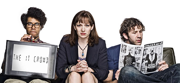
It's not all Bittorrent and Satellite though. "The IT Crowd" Series 2 recently finished over on good old Channel 4, and didn't really for me hit the comic heights of Series 1, but maybe repeated viewing will help. Certainly the first show with the theatre visit was superb, and Matt Berry is always good value as new boss Douglas. Loved Moss's appearance on "Dragon's Den" with his bra as well. Another returnee over on BBC2 was Steve Coogan's "Saxondale" which on it's first outing received a mixed reception from some quarters, but I loved it and always said that it needs time to bed in. Repeated viewing yields delights you may have missed first time round. The second series was almost all entirely good, with some unexpected subtle humour from Coogan, and Morwenna Banks is excellent every week as the bitchy Vicky back at the office.

Even BBC1 has got a reasonably funny sitcom at last with "Not Going Out", which on the surface looks to be a typically creaky British sitcom, but has a gag rate to almost rival "Friends" at it's peak. Lee Mack & Tim Vine make a great double act and hopefully there will be another series (check out co-writer Andrew Collins's blog listed somewhere to your right for more info). Could do without Miranda Hart's cleaner though - how does someone so untalented get work?

BBC4 has given us the return of "Charlie Brooker's Screenwipe", for another frustratingly short run. So far he's done a brilliant job of exposing the way News has been dumbed down over the years and a scathing attack on the BBC's policy of shrinking credits at the end of their shows. All done by Mr Brooker with liberal amounts of gurning and swearing.

"Spooks" is back on BBC 1 and is back on form after the patchy Series Five, with a gripping story about biological germ warfare. Hints that the storylines may wrap over from one week to the next more so than before have been confirmed with two cliffhangers at the climax of the first two episodes, and the ever present threat that any of the main cast members may get killed off. Quality escapist drama. "Top Gear" has bedded in on Sundays again, with the usual mix of cars you'll never afford and the boys being arses. The first show was a bit shit to be honest, but the second with the return of the task - this time across the Channel by car... in water - was irresponsible fun. Clarkson, Hammond and May are like a "Last Of The Summer Wine" for the Nintendo generation.

And a good Doctor Who fan like myself is being kept reasonably placated until the next series by "The Sarah Jane Adventures" on CBBC. This is pure kids TV but it's actually different because it's good, keeping up the standards set by the pilot and frankly is just a fun undemanding romp, with the farting Slitheen finally finding their natural home in the world of Dick & Dom and Shaun The Sheep. Not that all this means that the scripts are dumbed down, no way. It reminds me of the really good children's adventure mysteries that the BBC used to do so well back in the day, with half decent acting even from the kids. And if Elisabeth Sladen's not had botox then I want to know what she's taking, because she's wearing far too well for a woman of 59!

And the treat of the week so far for me is "The Peter Serafinowicz Show". From the people who brought you "Look Around You" half an hour of more stupid spoofs and impressions. "Who he?" you may ask. Well, you'll have seen him in many a comedy over the last ten years, but notably in "Hardware" with Martin Freeman, as Tim's paint-balling nemesis Duane Benzie in "Spaced" and as Pegg & Frost's bad-tempered flatmate who turns into a zombie (as you do) in "Shaun Of The Dead". Oh, and he was the voice of Darth Maul. Highlights so far are the excellent Shopping Channel sketches, Brian Butterfield the crap lawyer, adverts for "Kitchen Bang!", and an uncanny Michael Caine Acting Masterclass which, having seen the original I can safely vouch for it's accuracy. And that's what's great about it - even when the jokes are weak, it more than makes up for that by the amount of care and attention to detail that shines through.
And that's about it. Who says there's nothing on the box?


