Thursday, March 01, 2007

I'd love it if Kevin Keegan came back to Football, love it

Watching football on television these days is not as much fun as it used to be, mainly because the standard of pundit is so average and bland. Rarely now do we have the utterly banal and stupid comments from so called experts who would rarely engage their brain before their mouths. Ever since Big Ron Atkinson's supposed off air racist comments about Marcel Desailly, the average commentary team are as vanilla as they come.

Even most managers after-match comments are dull these days, knowing as they do that any slightly stupid or controversial comment would be pounced upon by either the media or the FA, so it's only right at this time that we pay homage to a past master of inanity, who's incisive analysis of "the Beautiful Game" was as good as his ability to manage a team.

Ladies and gentlemen, I present... the sadly missed serial quitter Kevin Keegan.


There's no better way to celebrate the career of a man who once uttered "Batistuta is very good at pulling off defenders," than by looking at some of his finest oratories. Enjoy...

"People will say that was typical City, which really annoys me. But that's typical City, I suppose..."

"If I had a blank piece of paper there'd be five names on it."

"England have the best fans in the world and Scotland's fans are second to none."

"By the end Asprilla was knackered-o. I think that's the Spanish for it."

"They're the second best team in the world and there's no higher praise than that."

"I came to Nantes two years ago and it's much the same today, except that it's totally different."

"He's using his strength and that is his strength, his strength."

"You can't do better than go away from home and get a draw."

"The tide is very much in our court now."

"The ref was vertically 15 yards away."

"They compare Steve McManaman to Steve Heighway and he's nothing like him, but I can see why - it's because he's a bit different"

"The good news for Nigeria is that they're two-nil down very early in the game".

"He can't speak Turkey, but you can tell he's delighted."

"One of his strengths is not heading".

"Gary always weighed up his options, especially when he had no choice."

"There'll be no siestas in Madrid tonight."

"The substitute is about to come on - he's a player who was left out of the starting line-up today."

"That decision, for me, was almost certainly definitely wrong."

"It's understandable that people are keeping one eye on the pot and another up the chimney."

"In some ways, cramp is worse than having a broken leg."

"It's like a toaster, the ref's shirt pocket. Every time there's a tackle, up pops a yellow card."

"I'd love to be a mole on the wall in the Liverpool dressing room at half-time."

"The game has gone rather scrappy as both sides realise they could win this match or lose it."

'There are two schools of thought on the way the rest of this half is going to develop; everybody's got their own opinion...'

"Goalkeepers aren't born today until they're in their late twenties or thirties."

"The 33 or 34-year-olds will be 36 or 37 by the time the next World Cup comes around, if they're not careful."

"That would have been a goal if it wasn't saved."

"He'll also be very dangerous from set-pieces. That means he'll be a threat from free-kicks and corners in the final third of the field."

"Luis Figo is totally different to David Beckham, and vice versa".

"You need 88 points for the title and we’ve got 61 at present with 16 games to go, but if you set targets you limit yourself".

"Well, if that's true then it would be a big surprise, but then nothing surprises me in football these days."

"We are three games without defeat is another way of looking at it. But if we are honest we have taken two points from nine".


And the single defining moment of his career, his aftermatch interview with SKY when Sir Alex Ferguson wound him up good and proper resulting in Newcastle's bid for title glory going tits up, here complete and uncut in all its glory:


"When you do that with footballers, like he said about Leeds... I've kept really quiet, but I'll tell you something, he went down in my estimations when he said that. We have not resorted to that, but I'll tell you, you can tell him now, he'll be watching this, we're still fighting for this title. He's got to go to Middlesbrough and get something. I'll tell you honestly, I would love it if we beat them, love it."

Wednesday, February 28, 2007

A Nation Weeps. Not.


Pop twat and professional oxygen thief Jay Kay has admitted he is "giving up music" after "getting bored of touring" with his jazzwank combo Jamiroquai.

The Stevie Wonder impressionist singer has claimed he is sick of the industry, despite recently breaking the world record for the highest and lamest gig after performing in a Boeing 757, 35,000ft in the air.

And Jay Kay, who has somehow sold over 27 million records worldwide, some of which sound different from each other, says that he is now interested in meeting a "good woman" and having kids. As opposed to being an absolute bastard to women and acting like a kid as he seems to have done before.

Speaking to the Daily Mirror at the mile-high gig, Kay, older brother of light entertainer Peter, admitted he hasn't been happy for a while. He said: "I haven't been happy for a while." He added: "I've had some ups and downs but in the end the downs were just too many. When we talked about me leaving, I jumped at the chance." Pity he didn't jump out of the plane door.

The singer, famed for his love of fast cars, stupid bloody headgear and acting like a big hairy cock, added: "I'm bored. I don't want to go back on the road. We all need a rest to be honest. I don't need the money or a deal. Honest."

He threatened: "I might be back if I get my inspiration again, but who knows?"

He then departed leaving us with this trademark twatty statement: "All I'm going to do now is fly my helicopter and look for the right lady to have children with".

Kay during happier times, hitting a photographer who was in fact trying to take a photo of Lindsay Lohan. Not him.

None of this is a spin on the fact that due to him being long past his commercial peak of the mid 90's, his record company Sony chose NOT to renew his long standing contract, which ended recently with the obligatory contractual Greatest Hits compilation just in time for Xmas (a record incidentally he had a right good whinge about them releasing, despite it earning him a fat wad of cash. Knob).

All I know is that contrary to his hit single of the same name, if I ever stumbled across him in the street he'd soon realise that he isn't "Too Young To Die".

An emotional crowd reacts to the news

Next time: Jamie Oliver and why he should have his head forced through school railings and be force fed Turkey Twizzlers by council house mums with tattoos.

Monday, February 26, 2007

2000AD's Zarjaz Anniversary


"Borag Thungg, Squaxx dek Thargo"

.... translated as "Greetings, friend of Tharg". I'm suddenly feeling very old, as I've just realised that this week is the 30th Anniversary of the very first issue of a British comic institution, 2000AD. And I was there at the very beginning... let's go back... back....


Back in the Jubilee-tastic year of 1977, the only comics I read were "Look-In" (the Junior TV Times doncha know) and "Krazy" comic (and then "Whizzer & Chips" when they merged). I did always like Science Fiction though (or space stuff as we called it) and my attention must have diverted at some point to an advert on the telly for this new comic called "2000AD", with a green alien inviting us to experience the delights of this new thrilling weekly. Of course the lure of a free Space Spinner might have swung it. So I had my Nan pick this up from the local newsagent at a mighty price of 8p of our "Earth money" (I probably took some pop bottles back to pay for this). And so, there was Prog One in my grubby paws - it was great! It had Dan Dare in it so that drew the approval of my Nan & Grandad as they remembered his strip from the "Eagle" in the 50's & 60's.


It was full of picture strips of a gritty nature I'd not really seen before. This was no "Whizzer & Chips". Stories like "Flesh", where time travelling hunters go back to kill dinosaurs in order to take back to the 22nd Century where real meat is a scarcity... however the dinosaurs have different ideas... "Harlem Heroes" which was the Harlem Globetrotters meets Rollerball; "MACH One" featuring British agent John Probe as a thinly disguised variant on the popular "Six Million Dollar Man"; and what was meant to be the star of the comic, the aforementioned Dan Dare fighting the ever evil Mekon. All presided over by the editor from Betelgeuse Tharg, who disguised his spaceship as a office tower block in London and assigned his script and art droids to deliver maximum thrills to the buying public. Brilliant.


Issue 2 was even better, as it had some free "Biotronic" stickers to make yourself look like Steve Austin.. err I mean John Probe, but the real meat in that issue was the first legendary appearance of a character who would become the mainstay and star of the comic, Judge Dredd. Dredd was the no bullshit almost fascist cloned upholder of the law in MegaCity One; where crime struck he struck back, riding in on his improbably sexy Lawmaster bike taking out juves and perps with his lawgiver gun, never once revealing his face behind the mask (let's ignore the farrago of nonsense that was the Stallone movie... oh dear). Who can forget his catchphrase "I AM THE LAW!!!".


Here's some trademark Brian Bolland art:


With bloody brilliant artwork over the years by the likes of aforementioned Bolland, Dave "Watchmen" Gibbons & Mike McMahon, and great writing from Mills & Wagner, this was the real deal and kept me buying the comic week after week into the early 80's, throughout such stories as the "Judge Child", "The Cursed Earth" and "Judge Cal" sagas, not forgetting the iconic "Judge Death" stories (see below).

Here's some of Mike McMahon's unique artwork:


With the popularity of "Star Wars" and the like, IPC comics launched it's own glossier companion comics to 2000AD, such as "StarLord" (12p!! Outrageous) & "Tornado", but these didn't last long and got merged with 2000AD over time, with the best and most popular characters transferring over to the main comic. Two such strips from "StarLord" were cult fave "Strontium Dog" featuring the adventures of Johnny Alpha and my fave "Ro-Busters" featuring the robot duo of Rojaws & Hammer-Stein (don't groan) who went on to the more successful strip "The ABC Warriors".


This was one of my favourite covers from those early days...

If I was really lucky, I'd get a copy of the yearly Annual cheap in the January sales... I've still got this one below somewhere.


As I got older, I sort of grew out of 2000AD, but always kept a lookout to see how it was going, buying the odd issue in a sort of "old habits die hard" kind of way, usually an Anniversary issue to see what had been going on since the last purchase, such as Prog 500 below.


Of course during the graphic novel boom of the mid to late 80s, 2000AD changed somewhat to reflect the times and the strips became more adult and sophisticated, presenting the public with characters like "Halo Jones", "Nemesis", "Rogue Trooper" and "Nikolai Dante". And so it comes to 2007, and 2000AD is still going strong into the 21st Century, without a change of name, celebrating it's 30th birthday with Prog 1526. Dredd has his own "megazine" but still features as a regular in 2000AD, as it should be, even finally exploring how the Judges came into being with the recent "Origins" series .


The current glossy magazine is probably light-years away now from the almost toilet paper printed comic I read when I was 7, but as far as I can see the attitude and spirit remains intact, and if it's giving thrillpower to a new generation of kids that's great by me.


"Splundig Vur Thrigg!"

Friday, February 23, 2007

Phwoar! It's "Top Of The Pops"!

Design classic? Or sexist 70's tosh? Or an lame excuse to put pictures of models from the 70's in this blog? You decide, as we travel back to a time of power cuts, the three day week, the Rubettes and Big D peanuts and examine the crumpet-tastic bri-nylon bargain bin world of the "Top Of The Pops" albums...

For anybody under the age of 30, all this will be a complete mystery to them, and the sort of thing only ever seen in a tatty corner of some charity shop. But back in the 70's, these albums were the equivalent of the "Now" series of compilation albums we see these days. Released by budget record label Hallmark (later Pickwick), the "Top Of The Pops" album (no connection to the TV series of the same name, of course) contained a selection of the latest Top 20 hit singles compiled onto one album, the albums being released periodically through the year.

So far, so good. But these are not the original tracks or artists, oh no, these are cover versions recorded to sound as close to the originals as the time and budget would allow (which usually meant it sounded a bit crap), and sung by session singers. Fascinating fact: early albums contained vocals by the likes of Elton John before he was famous covering the hits of the day! The records would then find their way to Woolworths and the like, where you could buy them for about half the price of a normal album. Voila - the latest sounds at half the price. Sort of.

The album covers however were very much of their time. Sex sells, and never as blatantly as in the 70s. Each album's cover would be made up simply of the logo, a tracklisting and a glamour model of the time (your equivalent these days would be, I don't know, Jo Guest, Keeley Hazell [right] or some other Zoo mag type) pictured in a suggestive pose, but not too suggestive. None of your FHM or Loaded poses back then, it was all a bit more innocent. And that was it. No clever fonts or graphics. And you know, it works. I know looking at it now, it's all bit daft and lame, and could rightly from today's point of view be a bit contentious, but I think these have a certain sort of charm in a way, and is certainly to my eyes no more offensive that a "Carry On" movie is now. The covers have got that kitsch value yes, but there's an honesty about them that I like. No pretence, you know what you're getting, there you go mate.

Now, I maybe biased. Nobody likes a good looking bird, sorry, woman more than I do, but it's not just the chicks. I have got a soft spot for these records, as they always cropped up in the record collection at my Nan & Grandad's when I was living with them in my early years. Never ever knew if they were theirs, my Mum's or my Auntie's but there you go, they were around. I loved rifling through all their records, and even at five I knew that the "Top Of The Pops" covers were a bit naughty, but why I wasn't sure. There wasn't any thoughts of sex going through my head back then, I was more bothered with "Look In" comic and whether Dr Who would defeat the Zygons next Saturday teatime. But I loved to listen to the records, and read the crummy sleevenotes on the reverse, and look at the blue labels going round and round on the turntable... The covers of the albums you see here are the actual ones that we had and that I used to listen to on the massive wooden Stereogram (look it up) we had in the front room (or parlour).

Throughout the seventies, these records apparently used to rack up massive sales, but soon other labels like Ronco & K-Tel got wise to this and released their own hits compilations, except they licensed the real tracks from the major labels for their albums, and soon these sales overtook the cheapo "Top Of The Pops" series, and so it went on, until the majors realised in the 80's they could make more money by releasing their own compilations, hence "Now That's What I Call Music 658".

I didn't know until I did some research on the web that these "Top Of The Pops" albums were amazingly still being released well into the 80's , as you can see here by these covers featuring the two top Page Three models of that time, Samantha Fox and the lovely Linda Lusardi (who'ss very nice in real life, according to the even more lovely Celia). Who was buying these albums God only knows, but as you can see the design hadn't changed much, but that logo was a mistake, looking dated even for 1984. You have to say that you'd perversely love to hear how bad their cover of Ray Parker Jnr's "Ghostbusters" would be, or how the months of production and mixing that Trevor Horn put into "Two Tribes" would be reproduced by the boys at Pickwick in their lunch hour. I shudder to think, except to say it's probably akin to the bad cover versions you hear in WHSmith's these days.
Of course, where there's a hit formula, there's imitations, and never more so that with the "Top Of The Pops" albums. Rival budget labels such as Music For Pleasure and Contour released their own hit cover compilations, but the designs for these were not as successful as Hallmark's classic design. Yes, the glamourous model's there but it's not as good a concept. I mean, what's the girl in the "12 Tops" photo meant to be doing? Get your feet off the seats, woman.

MFP's "Hot Hits" series at least had a theme, which was gorgeous girls in a sporty pose. Which was an excuse for busty models to be pictured playing football, rugby, tennis, boxing, scuba diving or motorcross. How some of these sports could ever look sexy I don't know, but by God the photographers and models tried their best to do it in these shoots.
Now, I remember this cover with the buxom archeress from when I was about five years of age, but as explained I wasn't in the business of caring who she was. It's only now looking back I recognize her as Caroline Munro, cult film actress, "Lamb's Navy Rum" poster girl and most importantly, the sexy helicopter pilot & Stromberg henchwoman Naomi from the classic 1977 Roger Moore Bond "The Spy Who Loved Me". Forget Barbara Bach, Caroline was where it was at, because she had that helicopter with machine guns and everything, trying to blow Bond's Lotus Esprit off the road. Cool. Of course it's only when you're older you notice she's bloody gorgeous. She was on a TV documentary I saw recently and she still looks good 30 years on.

Ahem. Anyway, back on subject, the designers for "Hot Hits" (well I say designers, probably some blokes in the office half heartedly shoving some Letraset onto some girlie pictures, thinking "that'll do" and then legging it to the pub), bizarrely even attempted to make skiing look sexy, with partial success as you can see below...

I'll leave you to decide whether the "Top Of The Pops" covers are classics of their time or not, but look at this last image, and if it doesn't make you smile you've got no soul.

Thanks to "www.easyontheeye.net", "http://welcome.to/cover-girl" and "www.freespace.virgin.net/love.day/coverheaven/index.htm" for some of the covers.

Thursday, February 22, 2007

Brücke Überschuß gestörtes Wasser

Iconic album image, I grant you, but if you put your thumb over Paul Simon's face, Art Garfunkel suddenly gets a luxurious German handle bar moustache.
Well I found it amusing.

More Great Design: "Post" era Bjork

More fantastic design, from Icelandic pop-pixie Bjork, all culled from her most commercially successful era, and design-wise my favourite, the "Post" era (1995 to 1996). The design work on this album and it's accompanying single releases are consistently excellent, with the designers Me Company giving her a strong visual image throughout, which was carried throughout the promo videos, the tour and accompanying merchandise. Whereas the graphic design of the "Debut" album and it's accompanying singles tended to be quite muted, with blue tints and black and white, this time we had colour... lots of it!

The original album cover for "Post" was to feature Björk surrounded by silver balls with her tongue extended towards a falling silver ball. It was shot by Jean Baptiste Mondino, who did the sleeve for "Debut". This however was later scrapped, and re-shot by photographer and video director Stéphane Sednaoui. The "Post" theme is symbolised in the cover photo by the AirMail trim around Bjork's white jacket! My CD came in a luxuriously gorgeous digipack with a little fold out poster & booklet, all housed in a plastic pouch with carry strap. Lovely. The tour brochure was a massive 64 page book in a plastic protective cover... even the souvenir postcards came in a nice pouch embossed with the Bjork logo.

Record label One Little Indian always tend to overdo the releases from Bjork - why have one CD single when you could have three? - so most of the singles were released on 2 CDs, which meant two different yet complimentary designs. Problem was, they were soo stylish and cool you just had to have both. Such as...

Lead single "Army Of Me" depicts Bjork as a super heroine versus an evil Polar Bear. Why? We don't know, it is Bjork but it looks great, especially the evil bear which I had on a t-shirt:

"Isobel" uses early computer technology to give us two Bjorks, and some woodland motifs tying in with the video:

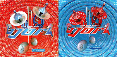
Crossover hit "It's All So Quiet" goes all big band on your ass:

"Hyperballad" carries forward similar imagery from the Michel Gondry directed promo video:

"I Miss You" reflects the cartoon nature of the accompanying video by depicting Bjork as a cartoon character along with her cartoon boyfriend (all done by "Ren & Stimpy" animator John Kricfalusi of Spümcø):

and finally "Possibly Maybe" rocks the trend with 3 CD's all housed gorgeously in a slipcase:

And this is before we even get to all the assorted promos and related items. A brilliantly sustained campaign. There's more stuff from those inventive bods at Me Company still to come...

Meanwhile check out their stylish website where there some great images you can "borrow": http://www.mecompany.com/