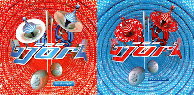
 More fantastic design, from Icelandic pop-pixie Bjork, all culled from her most commercially successful era, and design-wise my favourite, the "Post" era (1995 to 1996). The design work on this album and it's accompanying single releases are consistently excellent, with the designers Me Company giving her a strong visual image throughout, which was carried throughout the promo videos, the tour and accompanying merchandise. Whereas the graphic design of the "Debut" album and it's accompanying singles tended to be quite muted, with blue tints and black and white, this time we had colour... lots of it!
The original album cover for "Post" was to feature Björk surrounded by silver balls with her tongue extended towards a falling silver ball. It was shot by Jean Baptiste Mondino, who did the sleeve for "Debut". This however was later scrapped, and re-shot by photographer and video director Stéphane Sednaoui. The "Post" theme is symbolised in the cover photo by the AirMail trim around Bjork's white jacket! My CD came in a luxuriously gorgeous digipack with a little fold out poster & booklet, all housed in a plastic pouch with carry strap. Lovely. The tour brochure was a massive 64 page book in a plastic protective cover... even the souvenir postcards came in a nice pouch embossed with the Bjork logo.

Lead single "Army Of Me" depicts Bjork as a super heroine versus an evil Polar Bear. Why? We don't know, it is Bjork but it looks great, especially the evil bear which I had on a t-shirt:

Crossover hit "It's All So Quiet" goes all big band on your ass:
"Hyperballad" carries forward similar imagery from the Michel Gondry directed promo video:


Meanwhile check out their stylish website where there some great images you can "borrow": http://www.mecompany.com/


No comments:
Post a Comment